
Case study: RSA
RSA home insurance digital transformation
Contents
- Overview
- Problem statement
- Users and audience
- Roles and responsibilities
- Scope and constraints
- Process
- Results
Overview
A complete overhaul and redesign of the home insurance quote and buy journey — where users can enter their details to get a quote, review that information, and buy the policy if they want to.
RSA is a big insurance company. This journey started as a white label, to then be used and adapted by the various insurance brands that sit under RSA, including More Th>n.
Problem statement
RSA had made new partnerships with some banking brands looking to offer home insurance products. The goal was to produce a white label home insurance quote and buy journey. This could then be applied to RSA’s own brand, More Th>n, and be adapted to suit the new partner brands.
It was an opportunity for RSA to completely evaluate and update its home insurance journeys, competing with others in the market.
Users and audience
We had a wide range of users — essentially, anyone across the UK who has a home. This included those who rent, own, have a mortgage or share ownership.
Roles and responsibilities
I was content designer on the Home Transformation project. I was also lucky to work with another content designer on the team. The rest of the team included UX designers, UI designers, a project manager and a delivery manager.
We were also in contact with a data analyst and a team of developers.
Our wider stakeholders included:
- digital leads at the partner banks
- RSA product managers for the partner banks
- the product manager for More Th>n
- underwriters for RSA home insurance
- RSA’s legal and compliance team
Scope and constraints
The main constraint was dealing with such a large number of stakeholders, from different companies, and with different ideas. Some of these brands were more open to user research than others, worrying about security or were completely new to the digital design process.
There were also a number of deadlines that we had to stick to, so the new partnership contracts were maintained and seen as value for money.
Process
Process TL;DR
- We gathered information from RSA’s home insurance product team and their customer support
- Defined the information we need from users to give them an insurance quote from Underwriting
- Journey mapping workshop
- Produced a low-fidelity digital journey flow
- Kept Underwriting and the product managers in the loop with our proposed journey
- Empathy mapping workshop with partner brands and their RSA product managers
- Also spoke with the partner brands’ customer support
- Pair writing the questions and building a content document
- Ideation session to start design ideas
- Designers built a low-fidelity prototype of the idea we chose as a team
- Usability sessions with this prototype
- Presented this all back to the stakeholders
- Further refined the content, making sure it worked for the individual brands as well as Underwriting and Legal
- Designers improved the fidelity of the prototype
- Developed a content sign-off process that involved the right people and gave them time to review it and us time to update it
- Prototype was updated alongside the content changes we made
Firstly, we interviewed members of the home insurance product team to see which areas of getting a quote and buying home insurance customers currently struggled with. We also spoke to members of our customer support team to get data that backed up these claims and to see where else customers struggled.
We looked at what our competitors currently do in the industry. And we looked at those disrupting the industry.
The other content designer and I sat down with the Underwriting team to understand what questions we ask potential customers and why. We then took this list of questions and stripped out those we no longer needed or, in some cases, never needed. We then wrote these into vague, early draft questions — simpler and more straightforward to how they’re “officially” worded.
* * *
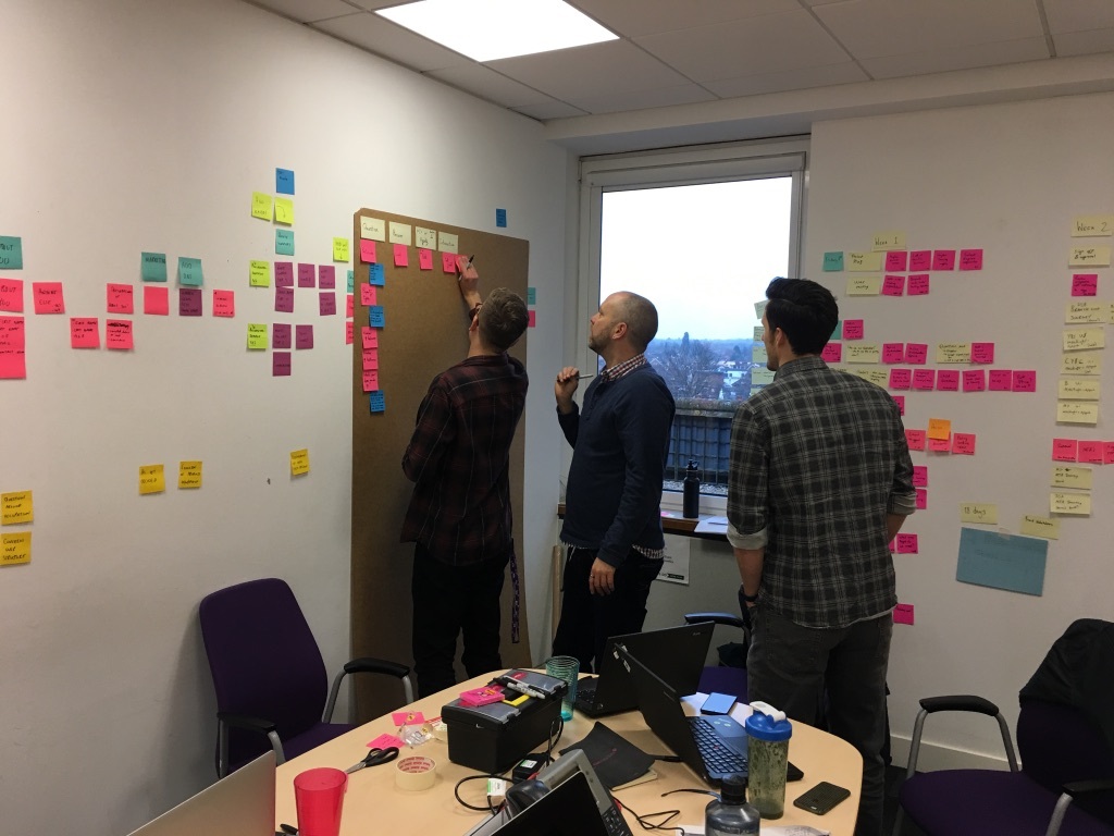
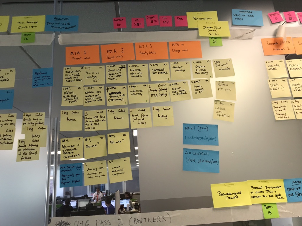
We then did a journey mapping workshop with the rest of the design team. We wrote each of the questions down on post-it notes and collectively started sticking them to a wall, trying to decipher a logical order. As part of this we started seeing natural sections form — ‘About you’, ‘Your building’, ‘Your contents’ — so we recorded these too.
The designers recorded this ‘post-it note journey on a wall’ into a digital journey flow we could all access whenever we needed to.
We then walked Underwriting through our flow to see if it collected all the information we needed to provide an insurance quote. We also showed this to the product managers as an indication of the direction we were heading in and to see if this matched their expectations.
* * *
Next we invited representatives from the partner brands and their RSA product managers to an empathy mapping workshop. This was a good time to understand any issues they were currently aware of and to understand the full end-to-end journey — either buying in a bank brand or through the phone with their customer support.
Speaking to those who worked on the partner brands’ customer support gave us a deeper understanding of the frustrations users had as well.
* * *
We then started adding to the bones of our early work. The other content designer and I began pair writing the questions in a content document (a spreadsheet). This gave us the first fullest idea of the sheer amount of information we would need to present and collect.
With this content document in mind we did an ideation session to get some design ideas out. We then decided to focus on the best idea we had — ‘one thing per screen’. The idea was, rather than presenting users a webpage which was just a list of questions as More Th>n did at the time, we would present one question per screen. This was inspired by the work done by GDS on GOV.UK.
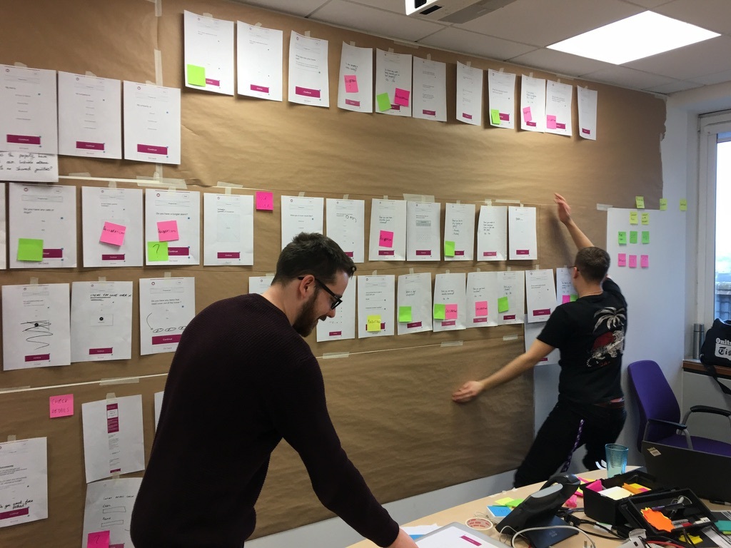
Next, the designers started producing early low-fidelity wireframes. Also, we did some early usability testing to see if our idea worked as expected. The results from this testing were put together with the content document and low-fidelity wireframes. We then presented this back to the stakeholders as our pitch — which they agreed to.
* * *
We then collected together style guides from the different brands and went about applying this to the questions. Not all brands needed the same information, so we also had to remove the relevant questions for the right brands.
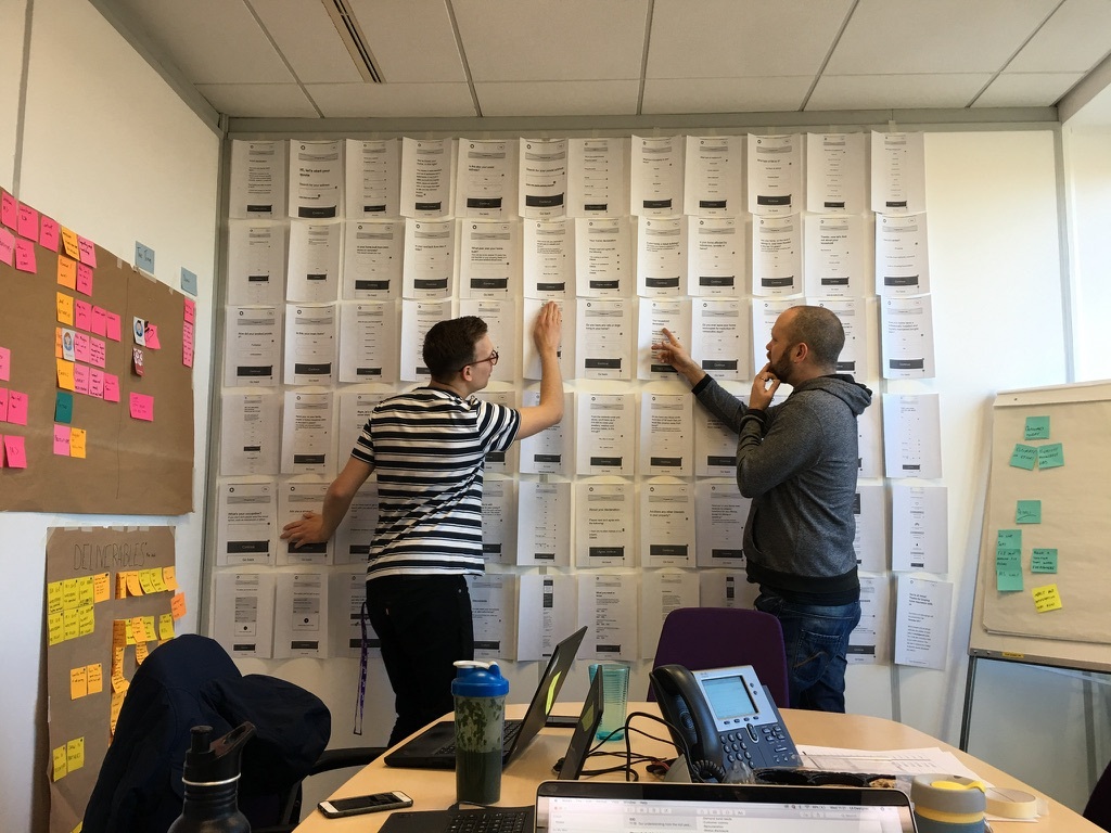
We further refined the questions based on this information to make sure the content was in a much better position. The designers also worked on introducing the interactions and improving the fidelity of the wireframes.
Then we did some more usability testing to keep us on track and connected to our users.
* * *
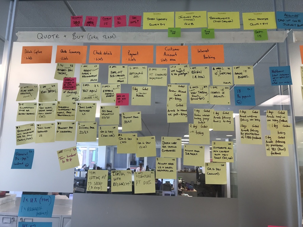
When we had the content in a position we were confident with, we looked into our sign off process — introducing to, and organising with, the stakeholders.
We decided on a limit of 3 rounds. We’d send out the spreadsheet, with a column for their comments, and give them a week to review. We would then have a meeting, all in the same room, and go through it comment-by-comment. We would then record whether we’d make the change, any questions or alternatives, or refuse the change, making sure we gave them a specific backed-up reason why.
We would then go away and spend a week making the changes and updating the spreadsheet. The process would then start again.
We had to do these 3 rounds with each of the 3 brands, so there were 9 sessions altogether.
These sessions were some of the hardest things I’ve ever had to do. They involved a huge amount of stakeholder management, connecting the needs of the user with that of the various arms of the business: underwriting, product, policy, brand and legal. I needed a keen eye to decipher what was a genuine piece of feedback or improvement, compared to someone’s opinion or preference. There were lots of difficult conversations and I had to keep a cool head to keep things collaborative, using our user research and UX design best practice to back-up our decisions.
These content changes were then fed back to the designers to update the prototypes, which meant we could continue testing and show the stakeholders the content in-context, not just on a spreadsheet.
Results
Unfortunately this project was so big I wasn’t able to see it through to the end. But I spent a year on this project and made some considerable progress and results.
We produced a huge amount of content, considering every variable and change in journey route. We took onboard the needs of Underwriting, Legal and the brand partners. And we connected these with the user needs we uncovered.
We established and developed a design sprint framework, introducing new ways of working to RSA. These ways of working are still used by the design team now (I’m sure they’ve added their own spin on it since). We also proved the value of user research and listening to your users. This was something RSA had not done a lot of and the partner brands had never done.
For me, this was a big step in my personal development. Before RSA, I had worked on a small team — just a couple of content designers and some developers — with only a small amount of oversight and stakeholder engagement. With RSA I was leading stakeholder review meetings, liaising with different teams and presenting work and findings back to the wider department.
I also worked with a talented team of designers and UX practitioners from a range of backgrounds. I learnt so much from them: ideas, lessons and inspiration I still carry with me today.